We want a change
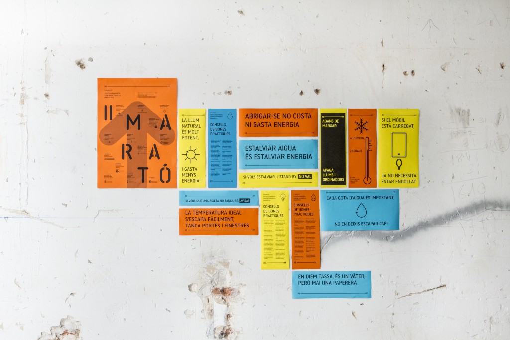
Saving Energy Marathon
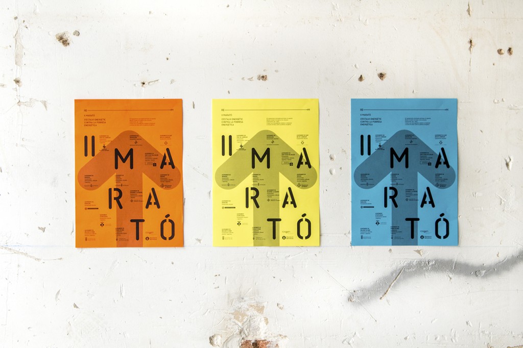
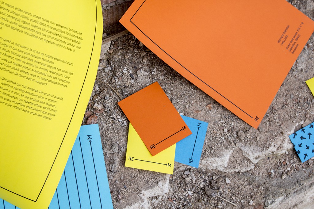
Double order that includes the visual identity of RE-M (Reduce Energy – Improve) and the II Energy Saving Marathon campaign against energy poverty.
Client: L’Origen
Year: 2017


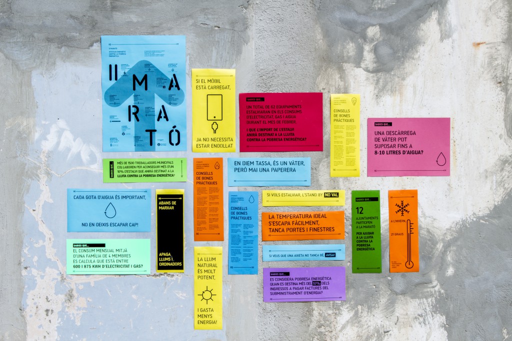
The goal of the marathon is that, during the month of February, municipal facilities from various towns in Catalonia save up as much as possible in terms of electricity, gas and water. The amount of saved energy is destined to homes in a situation of energy poverty.
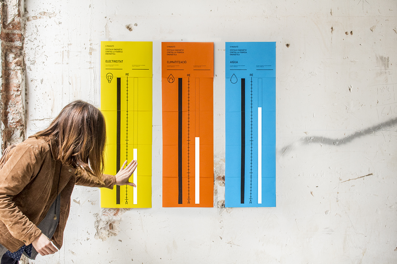
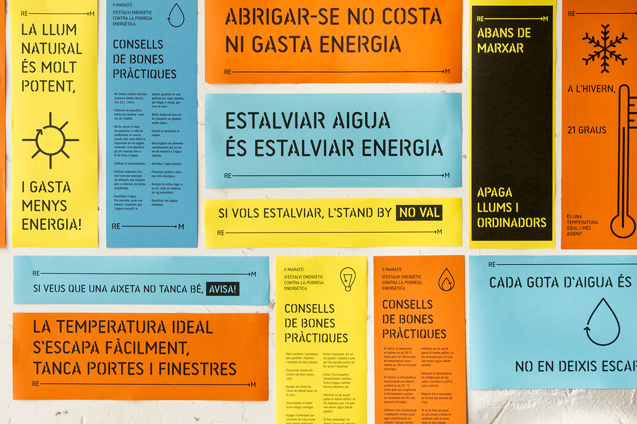
For the second edition of the energy Saving Marathon Against Energy poverty the campaign’s focus was energy saving, wich meant that we needed to work towards every staff member and user of their respective participating centres gaining awareness of their impact on the project through small gestures.
The best way to crearly visualise the energy saved is through large format indicators which simplify the data at hand and provide an easy way to compare weekly results with the data collected from the previous year’s edition.